What Inspires a Curator?
In today's post, Associate Curator Christina Johnson takes us behind the scenes of Inspired Eye: The Donald and Joan Damask Design Collection at the FIDM Museum, explaining how the exhibition's design serves the concept suggested by the objects on display.
**********
The opening reception for Inspired Eye: The Donald and Joan Damask Design Collection at the FIDM Museum took place on June 11, 2015 after months of research, designing, organizing, and yes, inspiration!
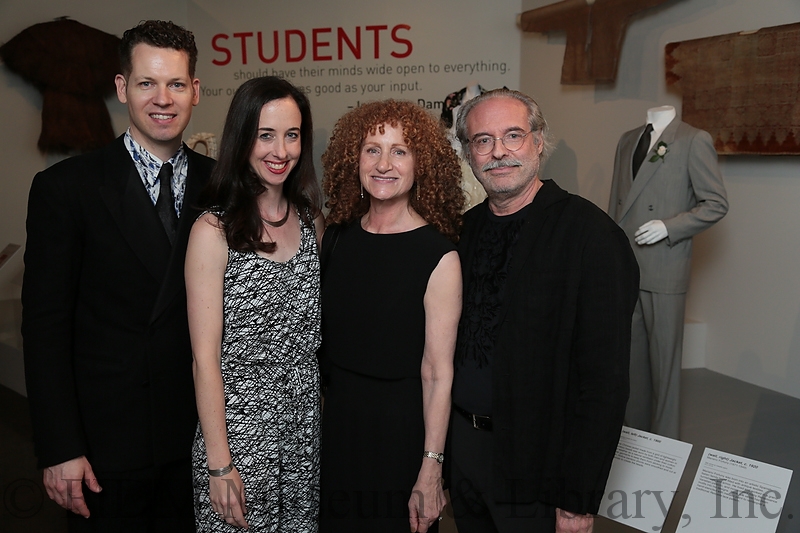 FIDM Museum Curator Kevin Jones, Associate Curator Christina Johnson, Joan and Donald Damask
This exhibition is the result of a major gift of fashion photography (including Willy Maywald and Horst. P Horst); vintage fashion and world dress (Prada, Westwood, Armani, for example); a massive Cecil Beaton archive of first editions, letters, photography and illustrations; rare art and fashion books; and ephemera from Donald and Joan’s careers in the fashion industry. With so many different types of objects, I decided the unifying theme should be “Inspiration”—the concept that each of these objects can be inspirational to designers today. I wanted FIDM students, especially, to come down to the gallery to sketch and photograph, and reference their favorites in their own designs for classes.
In my position as exhibition curator, I was responsible for selecting items from the larger donation for exhibition, researching them, and writing label content. I was also given the added responsibility of coming up with the exhibition concept and much of the exhibition design. In addition to drawing plans and laying out the objects’ order, I find that making a list of adjectives to describe the envisioned environment is really helpful in clarifying my thoughts and communicating them to other museum employees.
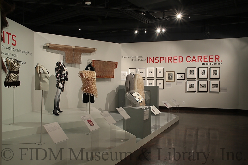
For Inspired Eye, I was inspired by the Damask’s home, where the majority of their donation was originally displayed. Their home is modern, sleek, and refined, so my exhibition concept was, too. Light dove grey paint was a neutral choice, allowing the art to "pop" away from the walls and platforms, while at the same time making the exhibition space seem as large as possible (dark colors condense interior space).
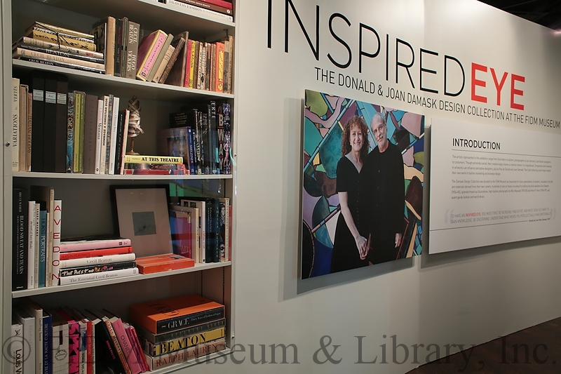
I knew I wanted to infuse the entire exhibition with Donald and Joan. I needed our audience to know them, to know why they collected certain things, and what their collections meant to them. I decided to reference their own bookcase in the title wall, how they tended to arrange the treasured books along with little figurines and framed art.
I didn’t have much space for thematic text panels, so I asked Donald and Joan for quotes about the themes I chose, and had those statements rendered in orange-red vinyl lettering (matching our FIDM Museum logo) high above the objects on display. The sans serif font matches the Damasks’ pared-down, contemporary aesthetic.
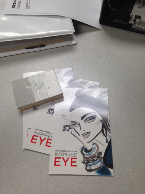
An exhibition’s brand image is vital for relaying what sorts of items will be on display to potential visitors. I played around with selecting a group of eyeballs from the donated photographs and illustrations, thinking about having a cluster of different eyes rendered in many media. But it looked too dense and was too hard to read, visually. The David Croland fashion illustration of a female face had an exciting visual energy, a pared-down palette, and, of course, great eyes—referencing my title and encapsulating the exhibition’s overall design aesthetic.
Here is the final advertising card next to paint samples—we were trying to find the perfect grey wall color! With exhibition design and curating, it’s always fun to see ideas and concepts become a tangible reality!
